
Open the LADCO Air Toxics Trends App
Open the LADCO Air Toxics Map App
App Description
These two applications visualize air toxics monitoring data across different locations in the Great Lakes region over time (2010 to 2023). They allow you to explore both geographical patterns and temporal trends of various annual average air toxics concentrations measured by air quality monitoring stations.
These two apps were developed by Alec Sheets (Ohio EPA) and Angie Dickens (LADCO) for the 2025 5-Year Air Monitoring Network Assessment for the Region 5 States.
Data Preparation
The apps plot the annual average concentrations of individual air toxics. These annual averages were calculated by:
- Downloading the raw toxics data from EPA’s Air Quality System (AQS),
- Replacing any values below the method detection limit (MDL) with one half of the MDL[1],
- Removing null data,
- Calculating daily means for each POC at a site,
- Calculating daily means averaging together the daily means at all POCs at a site,
- Calculating monthly means by averaging the daily means for each site,
- Calculating annual means by averaging the monthly means, with the requirement that the site must have at least three months of data in that year.
[1] This is a common way of treating data points below the MDL, as referenced here.
LADCO Air Toxics Trends App
The app has a sidebar for selecting data and a main panel showing visualizations:
- Data Selection (Left sidebar, Figure 1):
- Start by selecting a CBSA (Core Based Statistical Area).
- Choose one or more parameters (pollutants) to view.
- Select specific monitoring stations or all stations in the area.
- Set your desired date range using the calendar inputs (optional; the default is 2010 to 2023).
- Visualizations (Main window, Figure 1):
- The trends plots show how annual average concentrations (y) changed over time (x).
- Each line represents an individual site (the average of all POCs at that site, see data preparation above). Each site has a unique color and line type combination.
- A separate panel plot is shown for each pollutant, with the units for that pollutant listed below the name of the pollutant at the top of the plot.
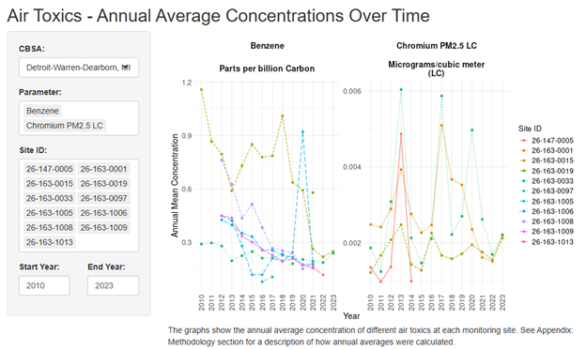
Figure 1. Screenshot of the LADCO Air Toxics Trends App, with example pollutants shown for Detroit.
LADCO Air Toxics Map App
- Data Selection (Left sidebar, Figure 2):
- Start by selecting a parameter to map.
- Use the slider to select a year to map
- Visualizations (Main window, Figure 2):
- The colors of the points in the map show how annual average concentrations vary by site across the region, where each point represents a monitoring site.
- The map is interactive, so you can zoom in on particular areas of interest or zoom out to look at the region as a whole.
- Click on a point to see the site ID, parameter name, the annual mean concentration for that year, the units, and the site operator in a pop-up window.
- Note that values in the color bar are reversed from the usual order, with the highest concentrations at the bottom (yellow) and the lowest concentrations at the top (purple). Note also that the order of these colors is different that that of the AQI scale, in which purple corresponds to highest concentrations and yellow to lower concentrations.
- The points with black outlines indicate that the monitor was operated by a federal, state, or local government agency. Points without black outlines were operated by a tribe, industry, or another entity (such as a university).
- The box below the slider lists the statistics (minimum, median, and maximum) for annual average concentrations across all monitors and all years.
- The units are listed in the legend, along with the parameter being plotted.
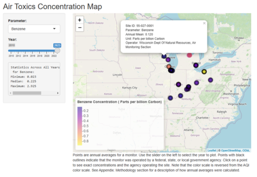
Figure 2. Screenshot of the LADCO Air Toxics Map app, with benzene shown as an example. Note the pop-up shown for one site as an example. Also note the pink monitors without black outlines in Michigan, indicating that they were operated by an entity other than a federal, state, or local government agency. (These are industrial monitors.)